- Title: One Mile At A Time
- Designer: Ryan Schroeder
- Instructed By:
Lori Young
- Course(s): ARTD 4070
- Tags: Print, Thesis, Typography
One Mile At A Time
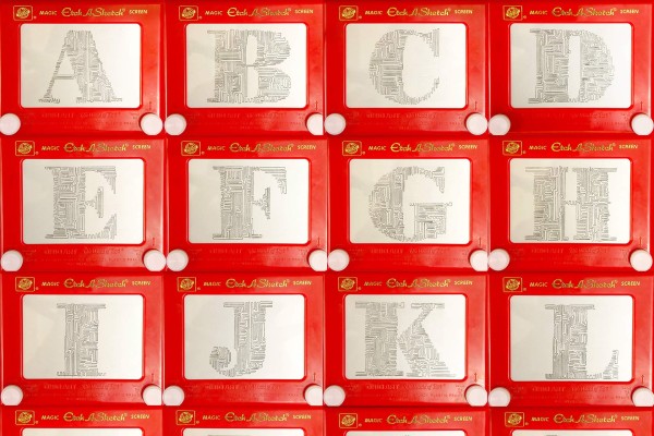
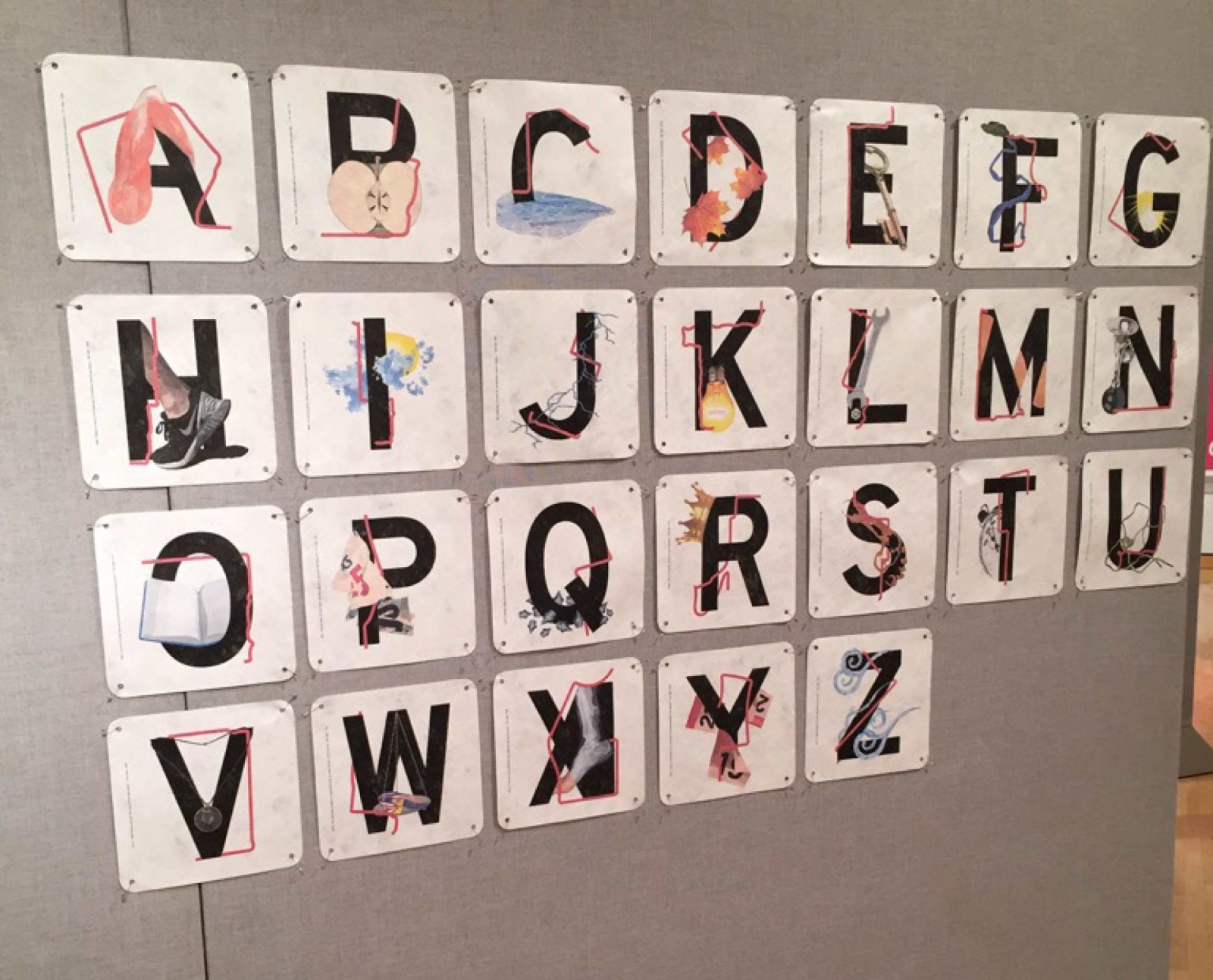
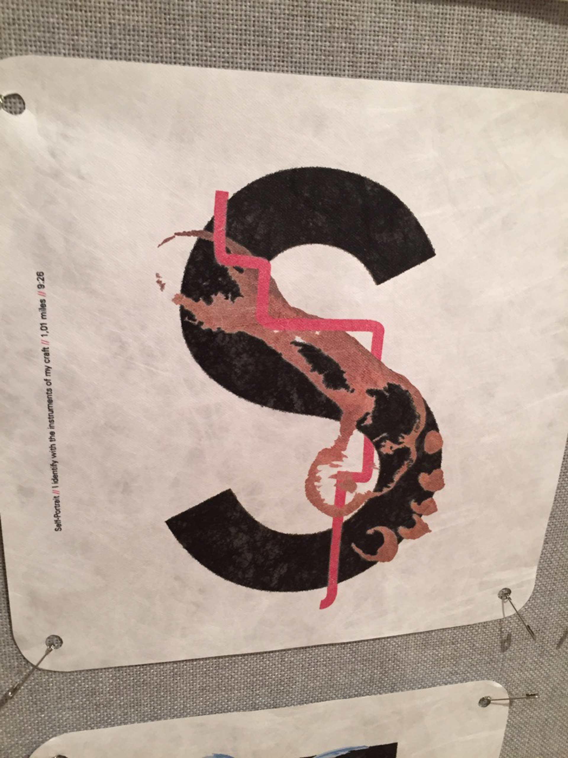
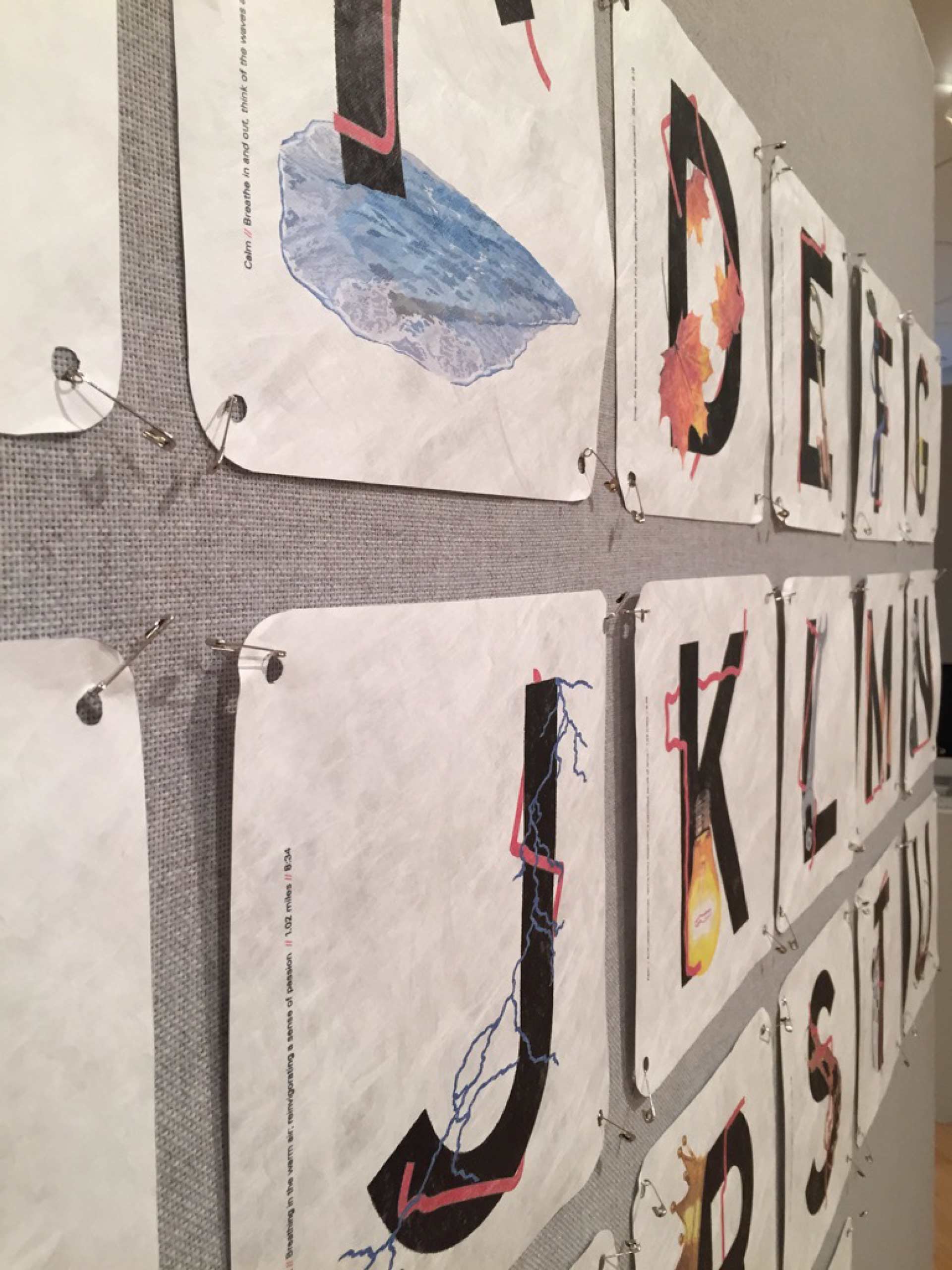
One Mile at a Time is an illustrative and expressive, yet formal alphabet that is directly related to personalized thoughts, ideas, emotions and physical feelings of long distance running. This collection physically displays not only my actual path of each mile but metaphorically explains how these different experiences can attach themselves to these runs, and become a physical manifestation of that environment. The typeface for each letter, Highway Gothic, symbolizes the actual environment of the run, referencing the way-finding and traveling roots of this experience; while the red line symbolizes the actual route taken, interacting with the letter form. Finally, each illustration connected to the form is a direct reference or metaphor for whatever experience, either physically or spiritually, that occurred during that run. The form of an alphabet is important because it serves as an identity system for me personally that tells a specific story, as the letterforms open the gateway for communication and specific storytelling. This is not a how-to or a step by step process of effective running. Rather, this is an expressive depiction of my experiences and personal development and relationship with running which will hopefully, at the very least, serve as an inspiration for others to go out and develop their own experiences with exercise and long distance running.